Menu Icon
Logo Logo

HOME ENERGY IN CALIFORNIA

As California’s energy prices and temperatures continue to rise, it’s more important than ever to take a complete view of your home energy systems. Baker ensures they are optimized and efficient, keeping your bills low and your family cool and comfortable.

Arrow Scroll

Style

Guide

SECONDARY FONT
INTER
PRIMARY FONT
INTER

COLOR THEORY

The use of colors to affect human emotions, health, and actions is an ancient art that modern science is still exploring. Branding and product design decisions are made based on how people respond to certain colors. The color Amber, for instance, exudes an energetic vibe, making it a superb choice as an accent color in your palette. Its radiant warmth blends seamlessly with hues like maroon or various shades of orange. Amber possesses the power to instill feelings of safety and confidence. Its warmth can foster a sense of security, while its brightness ignites boldness and inspiration. By prominently featuring Amber and shades of orange in our color palette, we effectively evoke the brand's core attributes—vibrancy, vitality, Energy, and sustainability.

COLOR PALETTE

The

Unfolding

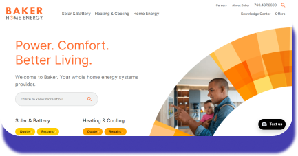
Our team designed and developed a dynamic front-end website customized to meet Baker Home Energy's unique needs. Through our prowess, we ingeniously devised service pages that were strategically positioned to offer visitors an unparalleled, crystal-clear, and breathtakingly comprehensive insight into the vast and boundless universe of Baker Home Electric's extraordinary services. Going the extra mile, we also incorporated a knowledge center featuring informative blogs. These digital platforms reflect our dedication to delivering innovative solutions that not only boost business growth but also improve the overall user experience.

Banner

Cyber

Resources

In the case of Baker Home Electric, we understood the critical need to not only achieve speed but also to achieve aesthetics of the highest order. Our design team set out on a mission to construct a visual story that harmonized seamlessly with the brand's core values, all while prioritizing a user-friendly interface. Striking a perfect equilibrium between beauty and utility, we infused contemporary design principles into the project, resulting in a harmonious, captivating, and user-friendly website experience, all accomplished within the constraints of a tight timeline.

Blob
MacBookPro
Product Product Product Product
Mobile Screen Website Image